Tuesday, April 14, 2015

Artist Post: Alejandro Duran


Alejandro Duran went to Tufts University, graduating with a major in Education and a minor in Literature. He was born in Mexico but spent the majority of his life in New York. His work includes Photography, installation and video. His latest work on display is located at Hunter’s East Harlem Art Gallery. His work is called “Washed Up: Transforming a Trashed Landscape”. Duran works mainly with Man and Nature and recently on how the negative effects of our pollution has carried through to the natural world around us. His images of trash which include; water bottles, old plastics, bottle caps, couch foam, flip flops, toothbrushes…etc. 


Alejandro’s work makes beauty out of something terrible. He places these old, broken, bent objects that are all relatively the same color and places them strategically around an around of nature to make it look like it belongs. This type of work makes a great impact because as the world has become more lazy it has simultaneously become more polluted. We have stopped caring about the environment and what our trash does to the ecosystems and Alejandro shows that effect. He has collected the trash from shores from over fifty nations of six continents. He carefully places his objects around Mexico’s largest federally protected reserve, Sian Ka’an. Duran wanted his pieces to mirror our current reality. He wanted to show how bad our impact is, even in places that aren’t creating the waste. Duran states, “ The resulting photo series depicts a new form of colonization by consumerism, where even undeveloped land is not safe from the far-reaching impact of our disposable culture.”


Duran uses similar colors in his pieces, blending the trash he places in the environment, and the environment himself. Some of the images it takes you a second to realize that it’s not just some random pretty natural object, but trash that has been made into beauty. He hides plastics throughout his work to blend it in with the nature, giving his photographs a cohesive feel. I like Duran’s work and his impact on society because in some ways it is a slap to the face. Showing the world what it has done to the natural beauty around us and showing us how our wasteful habits are negatively impacting everyone, not just developed areas. 


Link to his website: 

http://www.alejandroduran.com

Monday, April 6, 2015

Identify Yourself Article Review

This article has a lot of good points for the pros and cons of the internet. I think I have found that I feel impartial to the good or bad side because of my ability of self control. As a human I have the ability to log off or choose to interact with people in person, therefore I don't find it that big of a deal that we use the internet so much and that it has taken over. one thing I found particularly interesting and true is that the internet and technology in general has made us impatient. I think that the instant communication, instant answer, instant gratification is tainting society and making people expect things at a faster pace. Food taking too long at a restaurant, downloads on your computer taking forever…. so on and so forth. I think something else that has happened is the internet has made us lazy. Yes it is great that if you where wondering what the weather was going to be like tomorrow you can just check an app, but you can also check a different app to see the specific clothes you should wear for that type of weather. Now as amusing as that sounds it is also a little absurd that the internet is picking out clothes for us, it is computing according to the temperature estimated whether we should wear shorts or pants, a dress or a jacket. Another way I think the internet is hurting our society and our younger generations is that this laziness and creating stupidity. Instead of thinking through your long list of vocabulary you already know in your head or looking through the dictionary, kids just go to the thesaurus on dictionary.com and can find plenty of synonyms for whatever word they couldn't seem to remember. While I know there's a vast majority of information on the internet about current news and scientific sources to help with projects and keeping up with the times I think that their should be a limit to the amount of use. I remember being in lower school and having our teachers give us only a certain amount of time on the computers to let us research for our papers and then we would find our one online source and head to the library to collect our three or four book sources. It denied us the ability to be lazy and have the computer autocorrect our papers and find our flaws in our research and instead we had to do the work ourselves. I love how the internet has sped things up, but I think taking pride in your work is something that should come back into style.

Monday, March 9, 2015

Artist Post: Hope Little

Hope currently resides in Montreal and is working for Spafax as a freelance visual designer. She was in the graphic design program at Vancouver Visual College of Art & Design. She was offered a Junior design position at SapientNitro, an advertising company, which gave her lots of experience. She does work ranging from illustration to branding projects. Hope has worked for companies/brands such as Dejardins Insurance to Burton's snowboarding company. Each of her pieces has a feminine essence to it with delicate, hand-drawn lines and simple and yet very effective color.


The piece above perfectly describes Hope's artwork style. Flowery, feminine and yet precise and time consuming. She put's so much detail into these pieces it shows her skillful hand and her ability to take her illustrator skills and take it off the screen. This floral series of Hopes utilizes the shapes and patterns found within the flower and in nature in general and gives this idea of a jungle of flowers. The darker outline of the numbers gives you this idea of depth  which helps the detail in the bigger flowers more present. 

Here you get a more whimsical side of Hope and her artwork with the sad mountain tops with what looks like melting snow and cold air coming out of his mouth. Here you can see her freehand and I personally like the non-perfect lines because it gives the image an overall anime look. I think that her hand drawn work could be a little more witty with more faces or other figures other than the mountains. Although her work is meant to look laid back and relaxed almost like doodles, I feel like it would look better if the mouth of the mountain was at least open so that the puff of air would fit a little better in the image. 

The image above is from a vector illustration series named Tranimals. She began this series in 2012 as a way of delving into the different illustrative styles all by using geometric shapes. She captures the intimidating scrunch of the Tiger's face while still giving this cool geometric, boxy shape with the different shades of colors in the shapes. 


She created Sale and promo code banners for a women's used clothing store called Closet Collabos. Overall Hope's artwork shows her incredibly free spirit and her girly personality. Her work gives off this vibe that she is dedicated to her work and is about having fun and yet very into her detail and being specific. 

Wednesday, February 25, 2015

Tony Robbin


         Tony Robbin was born in Washington, D.C in 1943. He is an author and artist. His focus is mainly sculpture, painting and computer visualizations. He is also part of a movement called the Pattern and Decoration art movement. With over 25 exhibitions for his artwork and over 100 shared exhibitions, Tony became more well known. By 1974 he debuted his work in the Whitney Museum of American Art. He created an application of Quasicrystal geometry to architecture and was given a patent for his work in this field.  He has become a leader with the work in four-dimensional geometry in computer visualization.


(sculpture below)
            

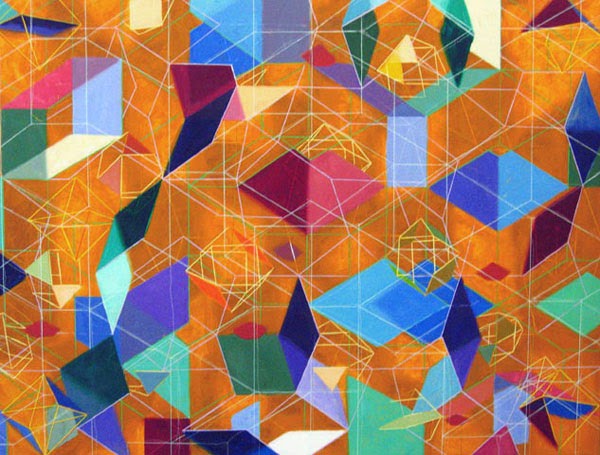
Utilizing technology, Tony produced digital prints which help him satisfy his idea of “Many spaces in the same place at the same time.” He wanted distinct overlays that gave his 3D effect a little more edge to it. This is his strategy for visualizing the fourth dimension which he has attempted for years.


(digital image below)

Higher dimensional space is the goal in which Tony tries to reach in all of his work. The layering and placement of clean-cut, precise lines gives you a visual rollercoaster ride. Along with his lining, the contrasting colors and overlays help give more dimension to each of his pieces of work. Each piece gives you this trippy feeling of falling into eternal space. Rhombus’, hexagons, and cubes are used to give you this sense of space within his photograph that makes you want to reach inside and touch that one cube that seems so far away from you, while not having the one jumping off the page hit you in the face. It messes with your mind.

 (painting below)

I think that Tony’s work has more of an impact with his sculpture and digital prints. While his paintings are aesthetically pleasing, they do not give the same depth effect I think he is trying to capture. I think his paintings and drawings do not pop out as much and I would prefer a sculpture piece with his dimensional use or a digital piece that has the ability to be morphed and distorted to tease your brain. What makes his work strong is his use of placement and angles. It teases and confuses the eye and makes something look like something it’s not.


Here is a link to his website which takes you to his artwork, essays, books and even films:

http://www.tonyrobbin.net

Thursday, February 5, 2015

Lewis Wickes Hine


In 1874, Lewis Wickes Hine was born in Oshkosh, Wisconsin. He put himself through the University of Chicago, New York University and Columbia University. He became a Sociology major and began to teach in New York. Lewis worked at Ethical Culture School where he taught his students to use photography as a tool for learning. Hine would bring his students to Ellis Island where they would photograph immigrants coming to America. Hine began to realize the impact these photos could give in social change.


The Pittsburgh Survey was a sociological study started by the Russell Sage Foundation. They hired Hine in 1906 to photograph steel-making districts and their every day lives. in 1908 he left his teaching position at Ethical Culture School to work for the National Child Labor Committee (NCLC).  Hine focused on child labor mainly in the Carolina Piedmont. He later used Galton's composite portraits to capture cotton mill child labor in 1913.


Lewis wanted to impact society with his photography and make a difference. These children were losing their youth. No education. Little to no pay. Children were working long hours in extreme temperatures, in factories and buildings with dangerous health risks.


Hine's early work shows these faces of children who should be happy, should be in school, should still have innocence. But instead they had to grow up as soon as they could walk and talk. Hine's photography was odd because of his placement of children. Usually looked staged and like he placed them in certain positions. Other times he photographed the children in their workplace doing their job but again had them hold still to get his shot.


Later on when Hine began to understand and delve deeper into his artistic abilities he started photographing for other companies and groups. One of his more famous collections was his photographs of the Empire State Building being designed and constructed. It depicts men laying, standing and sitting on these platforms that were well overtop the city.

The background of these photographs looks almost unreal. They seem photoshopped or painted in later on. But these photographs of these workers shows no fear or worry in their faces. 
Because of the time these photos were taken, camera technology was not that advanced. The quality of these photographs is not the best but it's the story they tell that impacts the viewer. The quality of Hine's photographs fits well with the industrial, labor induced age in which he took them. It gives them a hardier feel as if black and white photography showed all the darkness and sadness of these times hidden inside each and every little crevice.

Overall I love Lewis Hine's earlier work the most because of it's straight forward impact on society and blatant truth about child labor. He wanted to capture big changes in America and successfully grasped this tragic era's problems. Hine gave these child workers the ability to tell their own story with the way they presented themselves in each photograph he took.  


cites:


http://images.dailykos.com/images/68057/large/lewis-hine-child-labor-a-heavy-load-1909.jpg?1391618508
https://kyriolexy.files.wordpress.com/2013/11/hine2.jpg
http://www.bbc.com/news/magazine-17673213

Tuesday, February 3, 2015

Before and After


Bad photos before and after

before:


After: 

this photo had some very dark shadows and I wanted to lighten up our faces. One thing I found difficult was brightening up the photo without making his forehead too bright. 

Monday, February 2, 2015

Fun with photoshop

Ben loves his mother.

Body parts collage

I was inspired by all of the spirit finger scans to do a body related collage. I used hands, faces, hair, fingers, anything body image related. However there were a few students who didn't use body parts or images of themselves and that is where I had to become creative. I decided to use the King of Hearts card because of its name as a "face card". I also used a models face from a magazine someone had scanned.