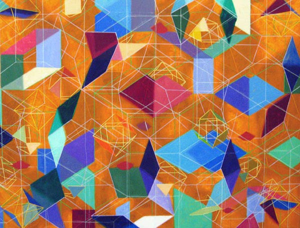
Tony Robbin was born in Washington, D.C in 1943. He is an author
and artist. His focus is mainly sculpture, painting and computer
visualizations. He is also part of a movement called the Pattern and Decoration
art movement. With over 25 exhibitions for his artwork and over 100 shared
exhibitions, Tony became more well known. By 1974 he debuted his work in the
Whitney Museum of American Art. He created an application of Quasicrystal
geometry to architecture and was given a patent for his work in this field. He has become a leader with the work in
four-dimensional geometry in computer visualization.
Utilizing
technology, Tony produced digital prints which help him satisfy his idea of
“Many spaces in the same place at the same time.” He wanted distinct overlays
that gave his 3D effect a little more edge to it. This is his strategy for
visualizing the fourth dimension which he has attempted for years.
(digital image below)
Higher dimensional space is the goal in which Tony tries to
reach in all of his work. The layering and placement of clean-cut, precise
lines gives you a visual rollercoaster ride. Along with his lining, the
contrasting colors and overlays help give more dimension to each of his pieces
of work. Each piece gives you this trippy feeling of falling into eternal
space. Rhombus’, hexagons, and cubes are used to give you this sense of space
within his photograph that makes you want to reach inside and touch that one
cube that seems so far away from you, while not having the one jumping off the
page hit you in the face. It messes with your mind.
 I think that Tony’s work has more of an impact with his
sculpture and digital prints. While his paintings are aesthetically pleasing,
they do not give the same depth effect I think he is trying to capture. I think
his paintings and drawings do not pop out as much and I would prefer a
sculpture piece with his dimensional use or a digital piece that has the
ability to be morphed and distorted to tease your brain. What makes his work
strong is his use of placement and angles. It teases and confuses the eye and makes
something look like something it’s not.
 Here is a link to his website which takes you to his artwork, essays, books and even films:
http://www.tonyrobbin.net


No comments:
Post a Comment